Covington is ready to launch its new logo and tagline. And though it’s not, “slow and steady wins the race,” that is the path they chose for its new creations.
“It was lengthy,” said Karla Slate, Covington’s communications and marketing manager, of the about two year long process. “I’m kind of happy it’s coming to an end.”
The Covington City Council approved an ordinance at its meeting May 27 adopting the slogan “Growing Toward Greatness,” along with a new logo that will replace the current steam locomotive emblem that has represented the city since the ‘90s. The new logo features three adjacent colored circles, with upward pointing arrows that are meant to signify both trees and growth. The logo will be officially unveiled during the Covington Days Festival, which is set for July 19-20. The celebration will be fully branded with the new design and slogan.
The rebranding process came from a partnership between the city’s Economic Development Council and Chamber of Commerce and City Manager Derek Matheson said it has been on the city’s to-do list since he started seven years ago. Officials have been working since the fall of 2012 to develop a brand that would help make the city more recognizable to those from outside the region. They received help from volunteer consultants and took public input from focus groups, interviews and surveys.
“It really applied to kind of everything,” Slate said. “…It’s about growth.”
The goal was to unify the city’s connection with nature, along with its developing location as a place to stop and shop. Derek Gillette, one of the consultants on the project, said at a 2013 chamber luncheon that the three main audiences for the branding message were: those who live in Covington, those who do business in the city and those who are visiting Covington.
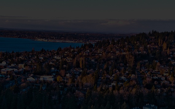
“That Covington is a destination,” Matheson told The Reporter. “Our trees are an important part of our identity.”
The city decided to primarily create the new logo and slogan in-house, rather than contract it out. Slate said the city used about $1,800 over two years and that the council approved $5,000 in the budget for the brand launch, which includes replacing items such as letterheads and signs. This runs counter to the city of Kent, which used $20,000 from its lodging tax revenue to pay for a new marketing slogan and logo. Matheson said he previously worked for a city that spent $90,000 for a logo and tagline.
“Rebrandings can be controversial and that’s not the case here, and I think that’s because we took the time to do it right,” Matheson said.
The vintage locomotive and stylized rendering of Mt. Rainier will remain as the city’s seal and be used on official documents.